Challenge
The concept needed to carry plenty of personality without turning into novelty merchandise, and the linework had to reproduce cleanly on curved, reflective products.
Drinkware and lifestyle / Branding single
Astronaut Juice turns an odd, memorable name into a clean product world: an astronaut holding Saturn like a balloon, calm letterspacing, and marks designed to look at home on mugs and packaging.
Services involved
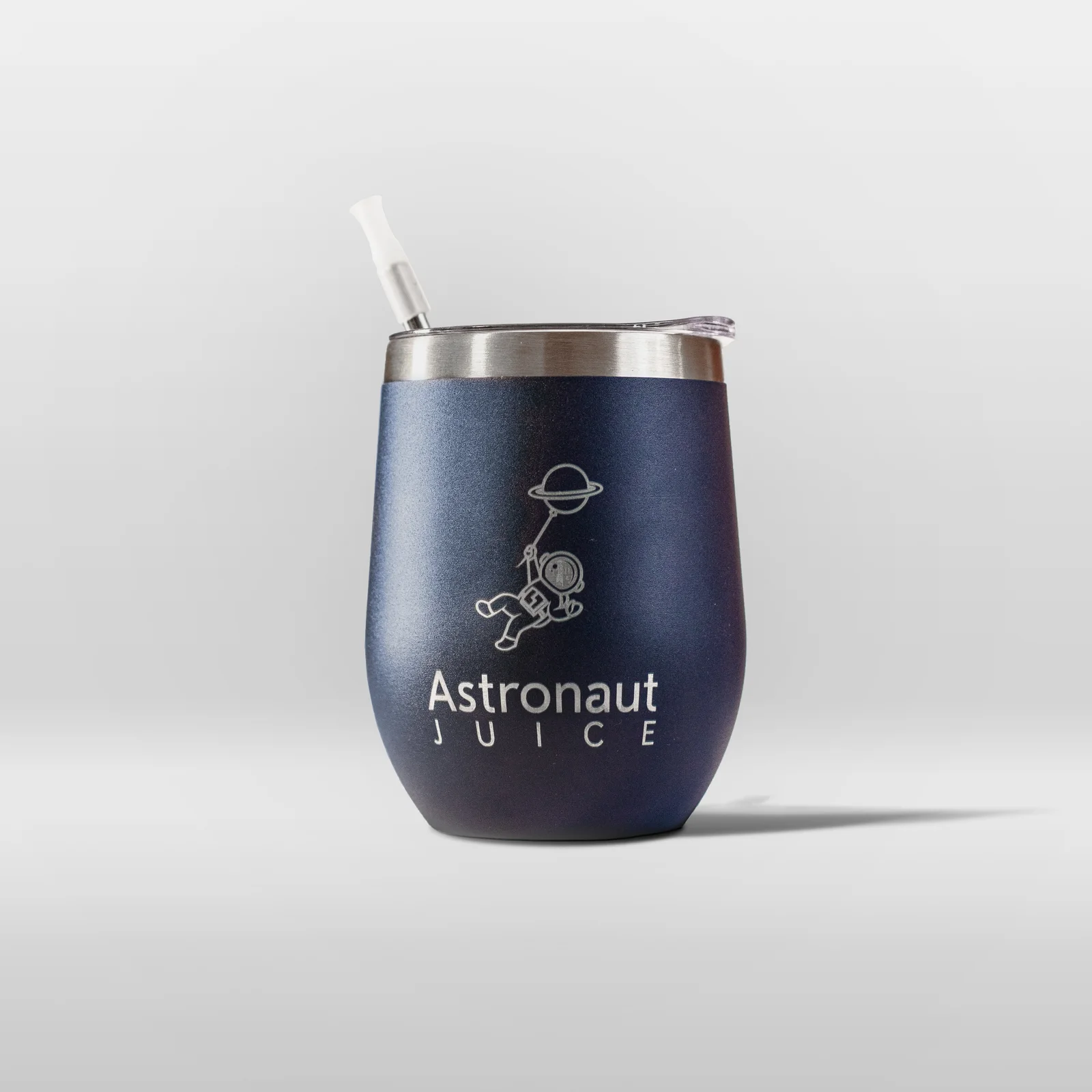
Brand in use / 6 examples
Real applications and identity outputs, shown at their natural proportions. Select any image to explore the full rollout.
The concept needed to carry plenty of personality without turning into novelty merchandise, and the linework had to reproduce cleanly on curved, reflective products.
We kept the illustration economical, paired it with widely tracked type, and prepared a practical family of one-colour and finish-ready assets for mugs, icons, labels, and care cards.
The result feels curious and premium at once: a small, recognisable universe that stays crisp whether printed in ink, foil, or a single product colour.
Identity field notes
Graphic product portraits, metallic details, bold colour fields, packaging layers and close crop material studies.
#161226 #EF6FAF #7651B5 #5F8FD3 #F7F3F8 The identity system
Foundation
The concept needed to carry plenty of personality without turning into novelty merchandise, and the linework had to reproduce cleanly on curved, reflective products.
Expression
We kept the illustration economical, paired it with widely tracked type, and prepared a practical family of one-colour and finish-ready assets for mugs, icons, labels, and care cards.
Everyday use
The result feels curious and premium at once: a small, recognisable universe that stays crisp whether printed in ink, foil, or a single product colour.
Brand toolkit
Next application
What gets made
The best brand work does not stop at a logo reveal. It gives every future touchpoint a point of view, a job, and enough flexibility to stay recognisable.
A considered piece of the system, documented for the people who will use it next.
A considered piece of the system, documented for the people who will use it next.
A considered piece of the system, documented for the people who will use it next.
A considered piece of the system, documented for the people who will use it next.
Phase 01
We find the tension, audience, references, and opportunity that should make the identity feel owned.
Phase 02
We shape the visual and verbal rules: marks, colour, type, image direction, and the principles behind them.
Phase 03
We put the system into the places that matter: website, packaging, social, signage, campaigns, and templates.
Next move