Challenge
The identity needed to feel unmistakably Irish and musical without leaning on the usual pub-brand shortcuts, while respecting a logo that was already part of the business.
Irish music and hospitality / Branding single
Grá Duit already had its logo. Leviathan's job was to turn that mark into a complete brand world with enough warmth, rhythm, and clarity to work across venues, social content, and the web.
Services involved
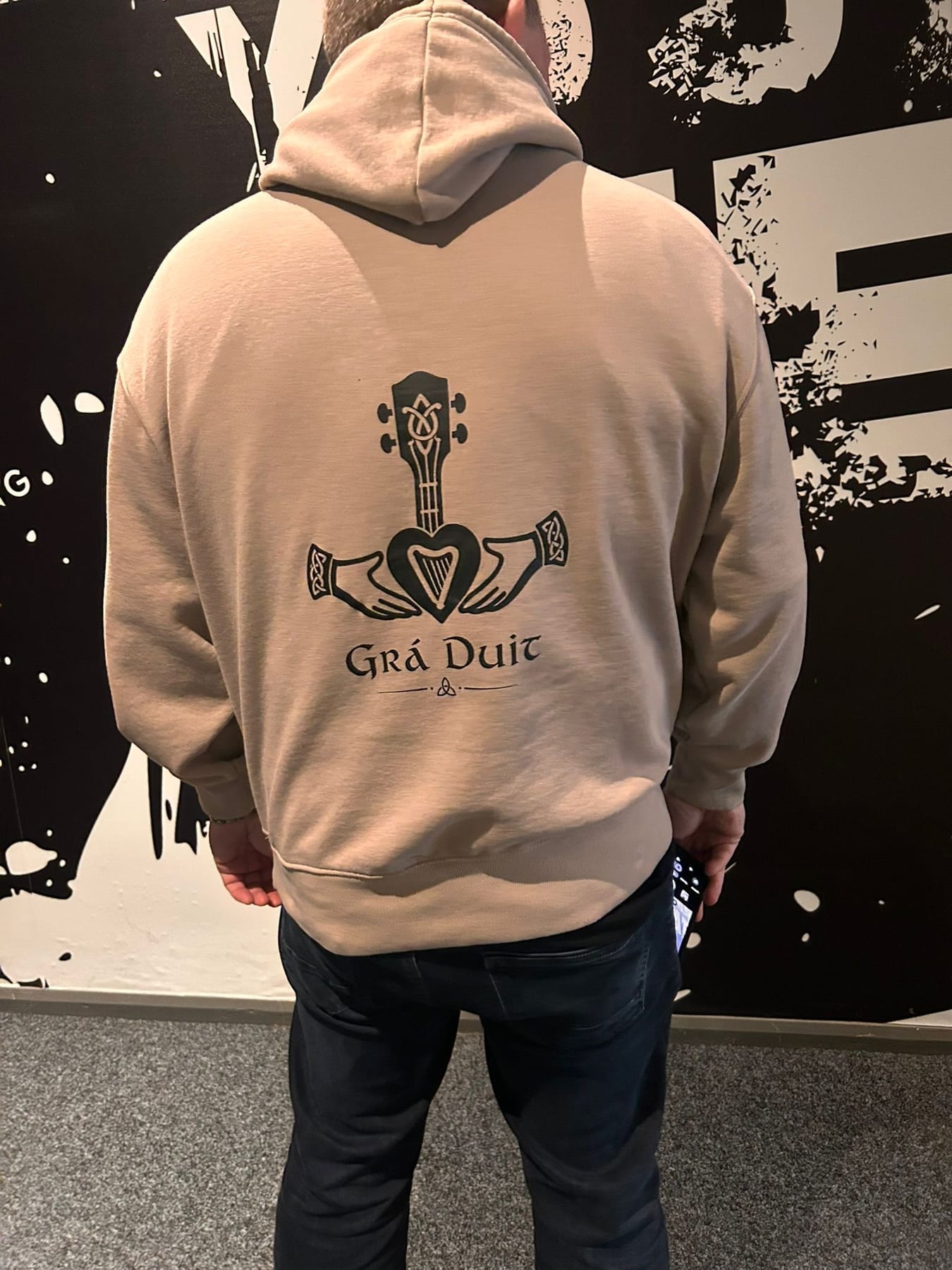
Brand in use / 15 examples
Real applications and identity outputs, shown at their natural proportions. Select any image to explore the full rollout.
The identity needed to feel unmistakably Irish and musical without leaning on the usual pub-brand shortcuts, while respecting a logo that was already part of the business.
We built the surrounding system: an atmospheric palette, expressive type hierarchy, image treatment, supporting motifs, and website direction that gives the existing mark room to lead.
Grá Duit now has a coherent identity beyond the logo: warm enough for live music, polished enough for partnerships, and flexible enough to move between a screen and a busy venue.
Identity field notes
Calm, honest and grounding: natural materials, handwritten textures, generous light and real human moments.
#FEF9F3 #141414 #E4D8CC #B2A28F #77706C #F1ECE5 The identity system
Foundation
The identity needed to feel unmistakably Irish and musical without leaning on the usual pub-brand shortcuts, while respecting a logo that was already part of the business.
Expression
We built the surrounding system: an atmospheric palette, expressive type hierarchy, image treatment, supporting motifs, and website direction that gives the existing mark room to lead.
Everyday use
Grá Duit now has a coherent identity beyond the logo: warm enough for live music, polished enough for partnerships, and flexible enough to move between a screen and a busy venue.
Brand toolkit
Also a website project
See how this identity behaves when it has to carry real content, journeys, and users.
Open the website case study →What gets made
The best brand work does not stop at a logo reveal. It gives every future touchpoint a point of view, a job, and enough flexibility to stay recognisable.
A considered piece of the system, documented for the people who will use it next.
A considered piece of the system, documented for the people who will use it next.
A considered piece of the system, documented for the people who will use it next.
A considered piece of the system, documented for the people who will use it next.
Phase 01
We find the tension, audience, references, and opportunity that should make the identity feel owned.
Phase 02
We shape the visual and verbal rules: marks, colour, type, image direction, and the principles behind them.
Phase 03
We put the system into the places that matter: website, packaging, social, signage, campaigns, and templates.
Next move