Challenge
The product needed to make restaurant choice feel social and low-pressure, while still giving a realtime app a clear identity.
Restaurant decision app / Branding single
No Forking Idea's identity had to feel like a game before it felt like software: quick, curious, friendly, and distinctive enough to be recognised on a phone.
Services involved
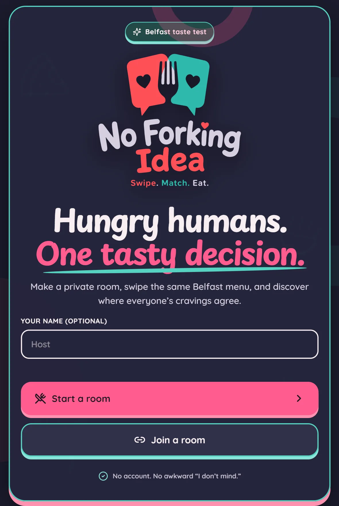
Brand in use / 5 examples
Real applications and identity outputs, shown at their natural proportions. Select any image to explore the full rollout.
The product needed to make restaurant choice feel social and low-pressure, while still giving a realtime app a clear identity.
We developed a navy-led identity around the 'no forking' joke, with a friendly icon, strong lockups, and a compact visual language that can move from app UI to launch material.
No Forking Idea now has a recognisable world for its swipe, match, room, and food moments—ready to grow from the Belfast prototype into a wider product.
Identity field notes
Bright, social food moments and playful phone-in-hand scenes; energetic without looking like a delivery app.
#FD5055 #2DB9AB #111F32 The identity system
Foundation
The product needed to make restaurant choice feel social and low-pressure, while still giving a realtime app a clear identity.
Expression
We developed a navy-led identity around the 'no forking' joke, with a friendly icon, strong lockups, and a compact visual language that can move from app UI to launch material.
Everyday use
No Forking Idea now has a recognisable world for its swipe, match, room, and food moments—ready to grow from the Belfast prototype into a wider product.
Brand toolkit
Also a website project
See how this identity behaves when it has to carry real content, journeys, and users.
Open the website case study →What gets made
The best brand work does not stop at a logo reveal. It gives every future touchpoint a point of view, a job, and enough flexibility to stay recognisable.
A considered piece of the system, documented for the people who will use it next.
A considered piece of the system, documented for the people who will use it next.
A considered piece of the system, documented for the people who will use it next.
A considered piece of the system, documented for the people who will use it next.
Phase 01
We find the tension, audience, references, and opportunity that should make the identity feel owned.
Phase 02
We shape the visual and verbal rules: marks, colour, type, image direction, and the principles behind them.
Phase 03
We put the system into the places that matter: website, packaging, social, signage, campaigns, and templates.
Next move