Challenge
The identity needed enough immediate fun for a sweet drinks brand, while staying legible and useful across everything from a storefront banner to a tiny watermark.
Drinks and hospitality / Branding single
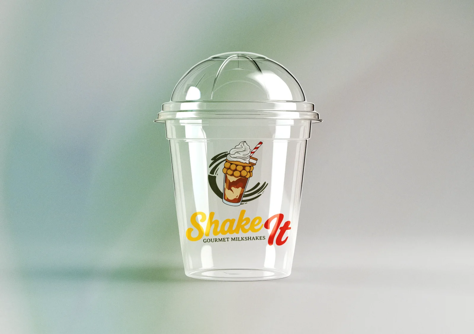
Shake It needed to feel energetic before anyone saw the menu. The identity combines a fluid wordmark with a whipped shake, straw, and motion lines to create a logo that behaves like the product.
Services involved
Brand in use / 3 examples
Real applications and identity outputs, shown at their natural proportions. Select any image to explore the full rollout.
The identity needed enough immediate fun for a sweet drinks brand, while staying legible and useful across everything from a storefront banner to a tiny watermark.
We drew a kinetic script mark around the silhouette of the product, then developed monochrome and colour variants, supporting type, and practical applications that keep the energy consistent at every scale.
Shake It has an identity that feels fast, bold, and ownable: a mark customers can recognise from across the street and a system that can keep changing with new flavours.
Identity field notes
Appetite-led close-ups: thick textures, imperfect handmade details, shopfront energy and packaging in use.
#E9BF3C #AB4032 #99AB38 #9C9F75 #616232 #8E9598 The identity system
Foundation
The identity needed enough immediate fun for a sweet drinks brand, while staying legible and useful across everything from a storefront banner to a tiny watermark.
Expression
We drew a kinetic script mark around the silhouette of the product, then developed monochrome and colour variants, supporting type, and practical applications that keep the energy consistent at every scale.
Everyday use
Shake It has an identity that feels fast, bold, and ownable: a mark customers can recognise from across the street and a system that can keep changing with new flavours.
Brand toolkit
Next application
What gets made
The best brand work does not stop at a logo reveal. It gives every future touchpoint a point of view, a job, and enough flexibility to stay recognisable.
A considered piece of the system, documented for the people who will use it next.
A considered piece of the system, documented for the people who will use it next.
A considered piece of the system, documented for the people who will use it next.
A considered piece of the system, documented for the people who will use it next.
Phase 01
We find the tension, audience, references, and opportunity that should make the identity feel owned.
Phase 02
We shape the visual and verbal rules: marks, colour, type, image direction, and the principles behind them.
Phase 03
We put the system into the places that matter: website, packaging, social, signage, campaigns, and templates.
Next move