Challenge
The brand had to speak to young people, families, carers, staff, and partners without becoming clinical, childish, or visually overwhelming.
Neurodivergent community / Branding single
Wired Different was a full-spectrum branding project: strategy, logo system, colour, typography, illustrated characters, campaigns, events, newsletters, signage, merchandise, and everyday business collateral.
Services involved
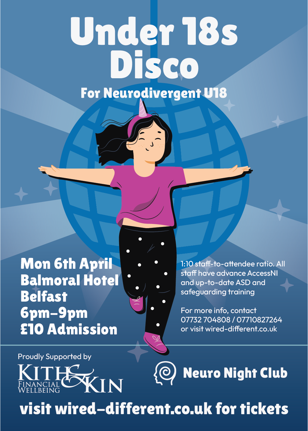
Brand in use / 3 examples
Real applications and identity outputs, shown at their natural proportions. Select any image to explore the full rollout.
The brand had to speak to young people, families, carers, staff, and partners without becoming clinical, childish, or visually overwhelming.
A deep blue foundation gives the system trust and calm, while vivid magenta accents, chunky rounded display type, and a flexible cast of illustrated characters keep it energetic, welcoming, and unmistakably theirs.
Wired Different gained a complete visual language that can carry a serious support mission and still make discos, campaigns, newsletters, apparel, and physical spaces feel joyful.
Identity field notes
Warm, candid community activity with real events, people, characters, signage and campaign materials.
#F2C8D5 #7871AA #7FD1B9 #141414 The identity system
Foundation
The brand had to speak to young people, families, carers, staff, and partners without becoming clinical, childish, or visually overwhelming.
Expression
A deep blue foundation gives the system trust and calm, while vivid magenta accents, chunky rounded display type, and a flexible cast of illustrated characters keep it energetic, welcoming, and unmistakably theirs.
Everyday use
Wired Different gained a complete visual language that can carry a serious support mission and still make discos, campaigns, newsletters, apparel, and physical spaces feel joyful.
Brand toolkit
Also a website project
See how this identity behaves when it has to carry real content, journeys, and users.
Open the website case study →What gets made
The best brand work does not stop at a logo reveal. It gives every future touchpoint a point of view, a job, and enough flexibility to stay recognisable.
A considered piece of the system, documented for the people who will use it next.
A considered piece of the system, documented for the people who will use it next.
A considered piece of the system, documented for the people who will use it next.
A considered piece of the system, documented for the people who will use it next.
Phase 01
We find the tension, audience, references, and opportunity that should make the identity feel owned.
Phase 02
We shape the visual and verbal rules: marks, colour, type, image direction, and the principles behind them.
Phase 03
We put the system into the places that matter: website, packaging, social, signage, campaigns, and templates.
Next move