Challenge
The visual language had to speak fluently to paranormal pop-culture fans while giving a complex platform its own coherent identity rather than becoming a loose collection of references.
Paranormal pop culture / Branding single
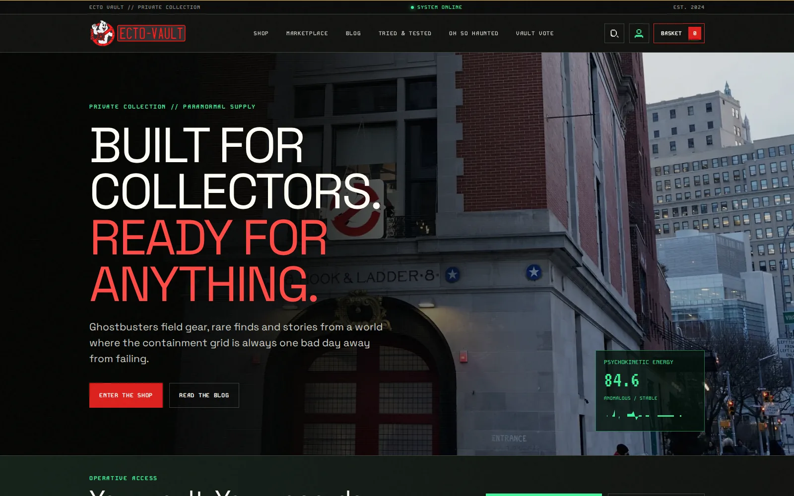
Ecto‑Vault needed to feel like a place, not a themed shop. Its identity turns an independent fan project into a complete operational world: part private museum, part equipment archive and part paranormal records department. Ecto‑Vault is not affiliated with or endorsed by Sony Pictures.
Services involved
Brand in use / 7 examples
Real applications and identity outputs, shown at their natural proportions. Select any image to explore the full rollout.
The visual language had to speak fluently to paranormal pop-culture fans while giving a complex platform its own coherent identity rather than becoming a loose collection of references.
A riveted red vault mark anchors the system. Archive labels, terminal typography, warning red, spectral green, museum frames, scan lines and deliberate glitches create atmosphere while clear hierarchy keeps every interface useful.
Ecto‑Vault has a recognisable world that can move from a product label to a seller storefront, investigation report, museum exhibition or full-screen terminal without losing its identity.
Identity field notes
Products filed like evidence, documentary paranormal locations and museum-style displays, layered with scan lines and deliberately controlled interference.
#0B0D0B #F12823 #40F39A #FFFDF5 #D7B51E The identity system
Foundation
The visual language had to speak fluently to paranormal pop-culture fans while giving a complex platform its own coherent identity rather than becoming a loose collection of references.
Expression
A riveted red vault mark anchors the system. Archive labels, terminal typography, warning red, spectral green, museum frames, scan lines and deliberate glitches create atmosphere while clear hierarchy keeps every interface useful.
Everyday use
Ecto‑Vault has a recognisable world that can move from a product label to a seller storefront, investigation report, museum exhibition or full-screen terminal without losing its identity.
Brand toolkit
Also a website project
See how this identity behaves when it has to carry real content, journeys, and users.
Open the website case study →What gets made
The best brand work does not stop at a logo reveal. It gives every future touchpoint a point of view, a job, and enough flexibility to stay recognisable.
A considered piece of the system, documented for the people who will use it next.
A considered piece of the system, documented for the people who will use it next.
A considered piece of the system, documented for the people who will use it next.
A considered piece of the system, documented for the people who will use it next.
Phase 01
We find the tension, audience, references, and opportunity that should make the identity feel owned.
Phase 02
We shape the visual and verbal rules: marks, colour, type, image direction, and the principles behind them.
Phase 03
We put the system into the places that matter: website, packaging, social, signage, campaigns, and templates.
Next move